The Rise of Dynamic Island and Its Unexpected Popularity
When Apple first unveiled the Dynamic Island, many thought it was a design gimmick, a clever disguise for the notch at the top of the screen. Yet, in a short span, it has evolved into one of the most appreciated innovations in the smartphone world.
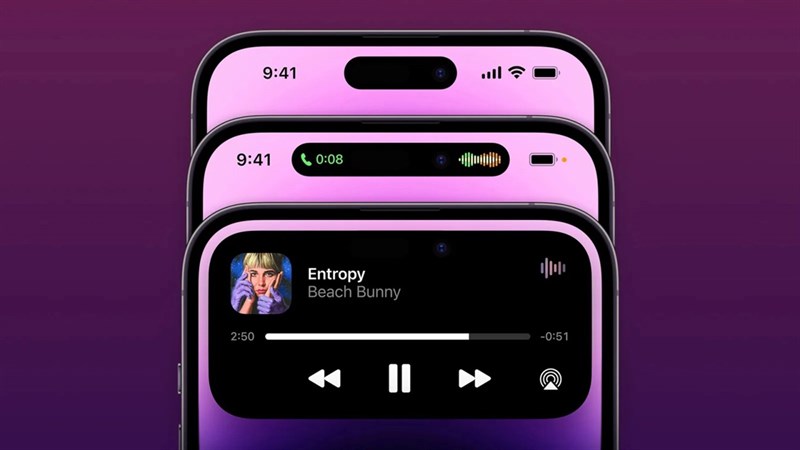
This feature transformed unused screen space into a hub for interactive notifications and ongoing activities. From timers to music and even food deliveries, it has become a part of users’ daily digital routines.
What makes this innovation stand out is how it reinvents simplicity. Instead of cluttering interfaces with notifications, it integrates information elegantly into a single floating capsule. As one user noted, “I personally am a fan of how intelligently they have utilized a dead space.”
This small yet powerful concept redefined how users perceive phone interaction, making Dynamic Island both practical and visually appealing.
In This Article:
Why Android Users Miss the Dynamic Island Experience
Even devoted Android fans admit to missing the Dynamic Island after switching to a different device. The reason is straightforward: it delivers immediate, contextual feedback in real time. For instance, a user who briefly switched to Android shared that they “dearly missed the Dynamic Island feature.” Whether tracking cricket scores, checking railway running status, or navigating with Google Maps, the experience feels incomplete without that subtle yet constant layer of interaction.
This attachment illustrates how deeply design affects user habits. Android users appreciate versatility, but few of their notification systems offer the same fluid transition between tasks.
Apple succeeded in merging utility with beauty, enriching mobile engagement through a feature that feels both human and intuitive. The Dynamic Island becomes a digital companion that lives quietly at the top of the display, always ready to assist without demanding full attention.
Accessibility and Human-Centered Design
Beyond aesthetics, Dynamic Island represents a breakthrough in accessibility. One of the most powerful real-life examples comes from a visually impaired user who uses a Dexcom Continuous Glucose Monitor (CGM). Through an app, their blood sugar levels are constantly displayed in the Dynamic Island. “It’s really helpful since I’m completely blind,” they said, “being able to just touch a part of the screen and hear what my blood sugar is at any given time.”
This testimony highlights Apple’s ongoing focus on inclusive design, ensuring technology adapts to people, not the other way around.
For individuals relying on assistive technologies, the Dynamic Island offers independence and convenience. Its haptic feedback, voiceover integration, and live updates give users immediate access to essential data.
The Everyday Convenience That Hooks Users
While some users utilize Dynamic Island for serious functions, others find delight in smaller conveniences. One person mentioned how they enjoy watching timer countdowns appear seamlessly. Another likes the way their food delivery or train updates remain visible as they browse social media or read messages.
The beauty lies in the balance between simplicity and depth.
Examples of everyday interactions include:
- Viewing real-time sports scores without opening an app.
- Tracking food delivery without switching screens.
- Navigating routes through Google Maps while using other apps.
- Managing ongoing calls or timers without cluttering the display.
Each of these small actions strengthens the connection between the user and their device. Even though some users mention that it “blocks part of the screen,” most agree that the convenience outweighs the visual intrusion.
A Case Study in Minimalism and Functionality
Minimalism has long been Apple’s design philosophy, and the Dynamic Island embodies that spirit perfectly. It merges hardware limitations with software creativity, proving that constraints often inspire innovation. This adaptable notification hub transforms and expands depending on what’s happening, from displaying music playback to showing navigation routes. The interaction is fluid, almost organic, making the experience feel alive and engaging.
Android manufacturers have attempted similar floating widgets, yet none match Apple’s unified integration. The secret lies in consistency: animations, shapes, and transitions behave predictably, creating trust in the system.
This predictable rhythm keeps users engaged subconsciously. With the Dynamic Island, Apple has transformed a technical necessity into an emotional connection, a feat that most software interfaces rarely achieve.
The Love-Hate Relationship With Screen Real Estate
Not everyone is entirely satisfied with the Dynamic Island. A few express frustration that it “blocks space and text from apps.”
While valid, this minor inconvenience underscores how often users interact with it. It’s visible precisely because it’s functional. The paradox of modern design is that features we rely on the most are also the ones we occasionally complain about.
Despite these criticisms, the overall sentiment remains positive. Users value the dynamic interactions more than the lost pixels.
For many, seeing timers or status updates floating at the top of the screen gives a sense of control and convenience. Over time, it becomes part of muscle memory, something you reach for instinctively without conscious effort.
Could Android Adopt Its Own Version?
With such high demand, it’s reasonable to question if Android will create a comparable feature. Some brands have attempted to introduce alternatives, but they often lack the consistency that Apple delivers. Android’s open ecosystem encourages experimentation, yet this also results in fragmentation. A cohesive, system-level version of the Dynamic Island could revolutionize Android’s user experience, bridging the gap between hardware and software.
As competition grows, cross-platform mobile engagement becomes a critical factor. Features like the Dynamic Island set new expectations for how users should interact with their devices. It demonstrates that even a small visual element can drive massive behavioral change. The next generation of Android devices may well follow this path, refining and expanding upon Apple’s groundwork.
Final Thoughts
In the end, the Dynamic Island proves that meaningful design doesn’t need to be grand or complicated. It takes something as simple as a screen cutout and turns it into a gateway for interaction, accessibility, and connection. Users who leave Apple’s ecosystem often find themselves missing it, not because of its looks, but because of how it makes their phones feel more alive and responsive.
Through thoughtful design, Apple has created a feature that enhances usability, promotes accessibility, and strengthens mobile engagement across daily tasks. The Dynamic Island may be small, but its influence is monumental – a reminder that innovation often begins in the tiniest spaces.