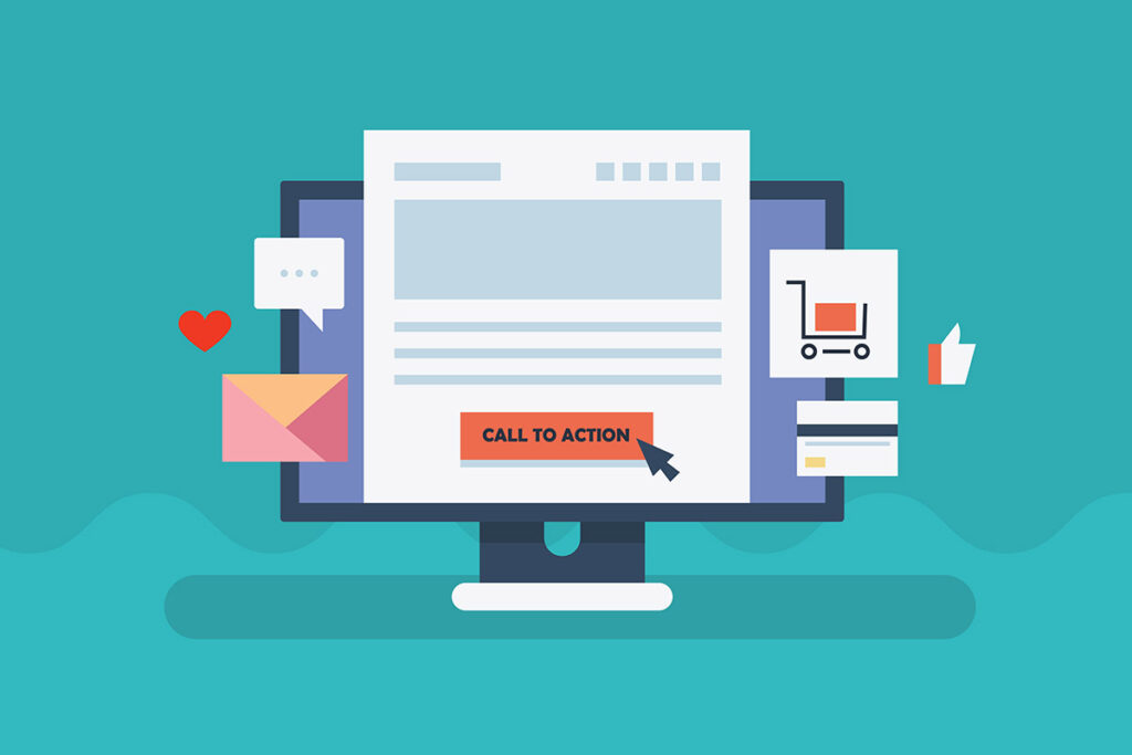
The CTA full form is “call to action,” which is a short yet powerful phrase that prompts customers to take immediate action. You can either encounter text forms like “Buy Now,” “Get the Deal,” or “Sign Up” with embedded links or visual buttons with eye-catching colors to grab audiences’ attention.
However, advertisers have many other ways to cleverly integrate the CTAs into their ads. Keep reading to learn more!
In This Article:
The Importance Of CTAs In Digital Marketing
According to Sixth City Marketing, an effective CTA can help boost the conversion rate by 121% for blog posts and increase sales by 1,617% for email campaigns. So, the most obvious benefit of call-to-action buttons is encouraging clicks, leads, and sales.
It’s because the short, impactful phrases spark a sense of urgency among audiences, prompting them to click or hit that button immediately. If an ad, email, webpage, or blog post lacks a CTA, customers might not know what to do next.
Additionally, using CTAs allows marketers to measure their marketing campaign’s performance more effortlessly. By tracking click-through rates, conversion rates, and other KPIs and employing A/B testing (we’ll explain this further in the next part), you can easily decide which CTA yields the best outcomes.
Types Of Call To Action
You can easily come across a CTA on blogs, web pages, landing pages, emails, social media posts, and advertising banners. They come in various forms, including:
- Buttons: This is the most common type of CTA, which is a colorful, noticeable button on banners, pop-up ads, website landing pages, etc. They only include one to three words that fit within a small box.
- Banners: When you visit a website, you will likely see banners at the top or on the side of the page. While not as impactful as CTA buttons, these banners are highly visible, catching visitors’ attention.
- Contextual links: Often referred to as internal links, these are links embedded within anchor texts to direct readers to another article on your website, providing them with more relevant information while also increasing traffic. For instance, you can include the link to an article about the call to action in an article about how to boost the click-through rate.
- Forms: Like surveys, forms are designed to collect customer data rather than increase conversion rates. They require customers to enter their personal information or answer some questions. In return, they might receive freebies or other rewards.
- Pop-ups: Once the most annoying type of call to action, pop-up forms are now more well-received as they usually come with special deals or discounts tailored to certain groups of customers. This personalization, combined with the limited timeframe, urges customers to seal the deal.
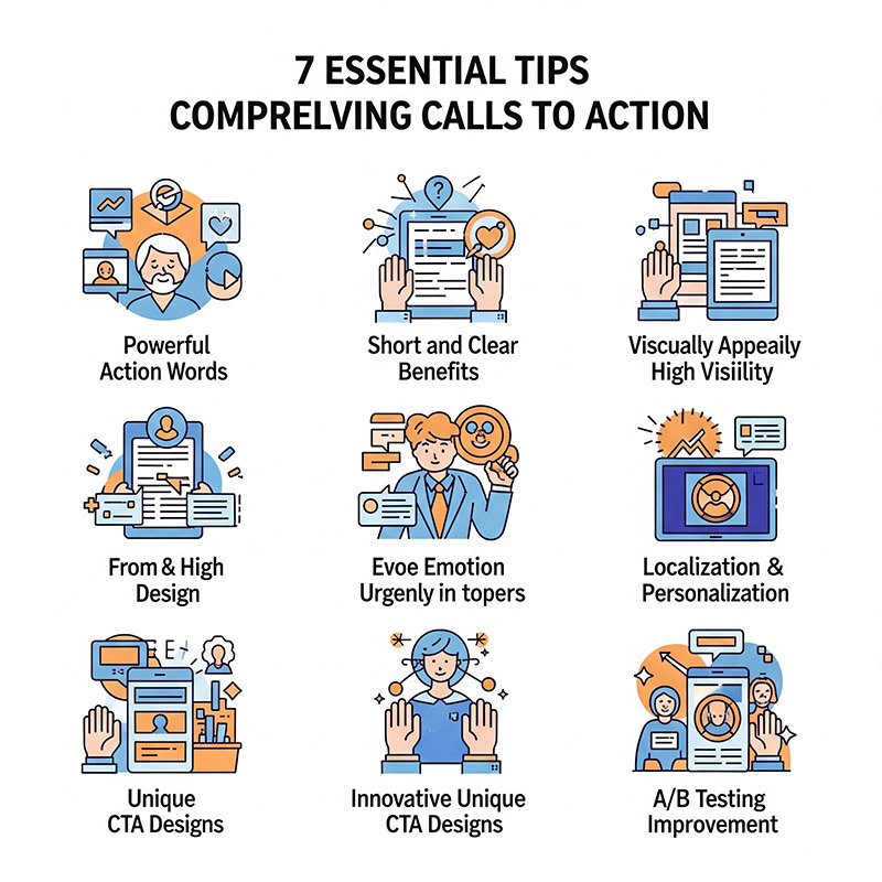
7 Tips To Write A Compelling CTA
Use Powerful Action Words
Powerful action words tap right into customers’ attention, motivating them to take immediate action. So, it’s best to start with a strong action word. Here’s an example to help you see the difference between using and not using an action verb:
Ready for a summer trip? – This is a soft CTA that focuses on igniting the interest of customers.
Book a trip now! – This is a strong, direct CTA that guides customers to the desired action – booking.
Below are some strong action words you can use for different purposes:
- e-Commerce: Shop, Buy, Pick, Order, View, Add to Cart, Reserve, Save
- Community or newsletter: Sign Up, Subscribe, Join, Refer
- SaaS conversion: Get Started, Try, Sign Up, Subscribe
- Freebie giveaway: Get, Grab, Download, Claim, Take
- Non-profit conversion: Volunteer, Donate, Give, Support, Adopt, Commit
- General: Learn More, Find Out, See How, Check it Out, See More, Continue, Click here, Start, Swipe Up
Keep It Short With Clear Benefits
CTAs are meant to be concise, so avoid trying to cram too many details or visual elements into them. Only write a short phrase, preferably two to three words and five to seven words at maximum. Don’t overload your call to action with a variety of options and benefits. Instead, choose the most valued, outstanding one to include in the CTA.
That said, being concise doesn’t mean keeping it flat and sacrificing benefits. Highlight the benefits or the brand value in the CTA, such as “Save $20,” “Save Money With 20% Off,” “Buy 1 Get 1,” “Get 30% off,” “Keep Your House Spotless,” etc.
Ensure Good Design And Visibility
By good design, we mean keeping your CTA clutter-free and well-organized, making it easy for customers to grasp the message right at a glance.
We recommend choosing a bright, high-contrast color that stands out from the background to grab attention. Also, use a larger font size than other text to highlight the call-to-action button.
Another thing that some marketers neglect is mobile optimization. As many audiences are switching to mobile devices for Internet browsing, it is essential to optimize your CTAs accordingly. For example, adjust the size (at least 44×44 pixels) and placement (preferably above the fold) or change the action word from “Click” to “Tap.”
Provoke Emotion And Spark A Sense Of Urgency
For some businesses, it’s a wise move to craft a longer CTA that provokes emotion among audiences (but it should still be concise). For example, if you are a furniture company, think of phrases like “Create your dream home with us!” or “Design your home your way!”. Other ways to add an emotional touch to your calls to action include using adjectives, numbers, your unique selling point (USP), or making a promise.
Additionally, you should also create a sense of FOMO and urgency by including a limited timeframe or using adverbs of time. For instance, “Buy Now” sounds more urgent than simply “Buy It.” Or, “Get 30% off before 1/7” makes customers feel that they need to buy soon before the deal expires.
Localize And Personalize Your CTAs
If your customers are spread across various regions and countries, localizing the CTA is crucial. Write in a language that different groups of customers can relate to. For example, use “Buy for $89” in the US market and “Buy for £89” for the UK audiences.
Personalization is just as important. Tailor your calls to action based on the target customer demographics, including gender, age, income, education level, and other relevant factors. For instance, for a clothing brand, you can infuse slang into your CTAs that resonate with the youth, such as “Get the new heat!” (where “heat” refers to new items).
However, if the target customers are mostly elderly, it’s best to stick with more classic and traditional language, such as “Timeless style, innovative comfort. Shop here!”.
Be Creative And Unique
General CTAs, such as “Sign Up” or “Buy Now,” can be found everywhere, so a unique and creative one will help you stand out from the crowd. You don’t have to follow the classic call-to-action examples of top brands. The key is to integrate your brand’s unique selling point and core value into the calls to action.
For example, if your company offers marketing services, a CTA like “Get seen online in 1 month” can be effective. Or, if you’re running a spa, consider “Get free hair wash each session” or any phrases that better deliver your brand’s USP.
Use A/B Testing
Let’s be real; no one can craft a perfect CTA from the beginning. You need to undergo numerous trials and errors, but A/B testing can be your shortcut. This method involves dividing your target audience into two groups and testing with two different calls to action. This allows you to determine the better version. Then, continue doing so until you reach the optimal CTA that resonates with most customers.
5 Examples Of Effective CTA Buttons
Elementor – “Save your seat. Book now” (Google Web Vitals Update Webinar)

Elementor runs this ad on Instagram with two CTAs: “Save your seat” and “Book now.” This sparks a sense of urgency and FOMO among the audience: book now, or it will run out of seats. Not to mention, the Save icon next to “Save” creates a visual appeal, catching the audience’s eyes.
CrazyEgg – “Show me my Heatmap”
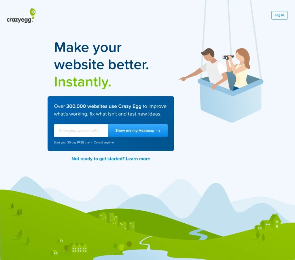
CrazyEgg starts by showing statistics about the number of websites that leverage its service to improve what’s working and fix what’s not. This establishes credibility and sparks a feeling of FOMO.
The word “Heatmap” acts as a modifier that shows customers what to expect if they hit that button. The brand also uses first-person phrasing (me, my) in the CTA to make it more relatable, further encouraging customers to click on it.
ClickUp – “Save one day every week. Guaranteed. Get more time.”

This CTA taps right into our pain point in the hectic life – lack of time. The promise of saving one day per week intrigues the audience, and the “Get more time” CTA provides the exact solution for most of us.
Touchland – “Keys. Wallet. Phone. Touchland. Get yours”
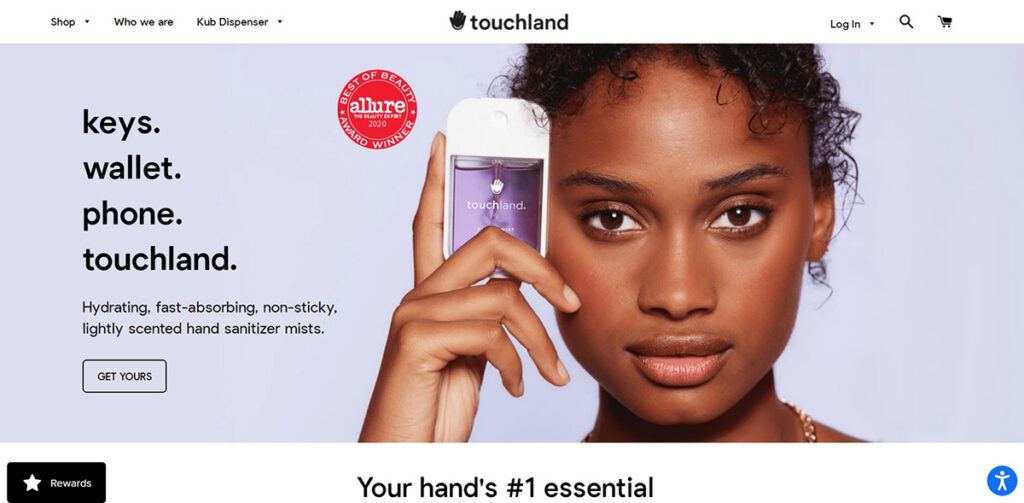
Touchland, a hand sanitizer brand, has crafted a concise and clever call-to-action. It lists its brand name among other essentials, such as keys, wallets, and phones, implying the importance of its products. The CTA “Get yours” gives the impression that everyone has bought Touchland, and you should, too.
Audiense – “Show me the findings”
In its ad, Audiense first shows a part of its analysis of political audiences, followed by a “Show me the findings” CTA. This taps into customers’ curiosity, urging them to click on it to read the full report. The use of first-person phrasing also enhances relatability, thereby boosting CTR.
Final Words – The Fine Line Between An Annoying And Compelling CTA
To wrap up, we can’t stress enough that marketers all walk a fine line between an annoying and compelling CTA. One of the biggest mistakes is using the same old CTA across multiple channels. Remember that each marketing channel caters to a different target audience, so make sure your CTAs are relatable for each segment.
Overloading your page with tons of CTAs is also a no-go. They might leave customers feeling overwhelmed and even annoyed, which can reduce the CTR.
To ensure your call to action is working effectively, track the click-through rate (CTR), cost per click (CPC), and conversion rate. These statistics enable you to evaluate its performance and make any necessary adjustments.


