If you’ve ever noticed a long, skinny ad running down the side of a website, that was probably a 160×600 ad. It’s known as the “skyscraper” because of its tall shape. With more space and better performance, it’s now a standard in many online ad campaigns. In this article, we’ll look at what makes it better and how you can make the most of it.
In This Article:
About The 160×600 Skyscraper Ads
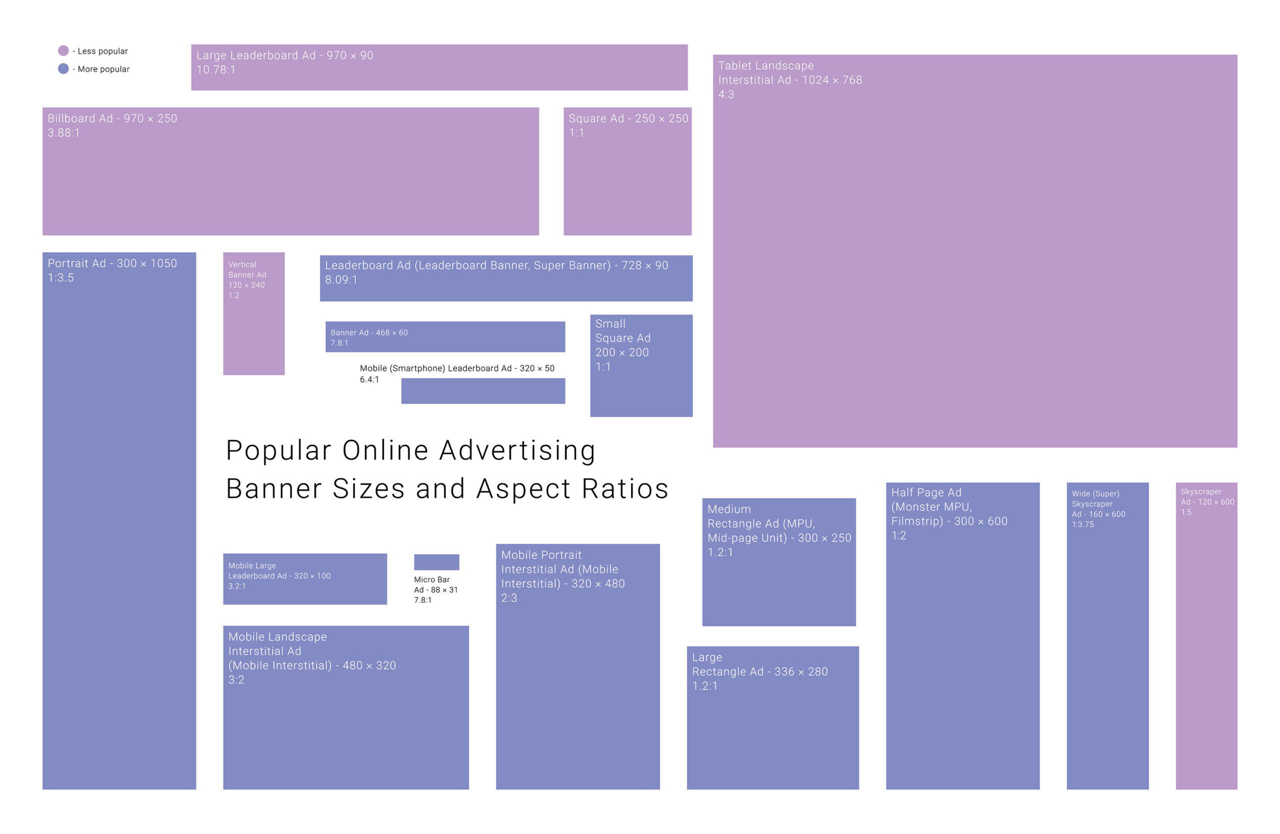
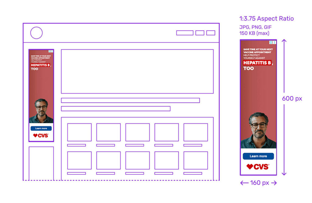
The 160×600 ad, often referred to as the Skyscraper, is a standard ad unit defined by the Interactive Advertising Bureau (IAB). Measuring 160 pixels wide by 600 pixels tall, this vertical format stands out due to its tall and narrow shape, hence the name “skyscraper.”

Originally introduced to replace the narrower 120×600 unit, the 160×600 ad offers enhanced visual space and performance, making it a preferred choice for sidebars on desktop websites.
Benefits Of The 160px x 600px Ad

One of the most compelling strengths of the 160×600 skyscraper ad is its persistent visibility. When placed in a sidebar, it often stays in view as users scroll, offering extended exposure time. This makes it an excellent fit for branding campaigns, where consistent visibility is key.
Advertisers and publishers also value this format for its excellent viewability rates and strong click-through performance, particularly when the design is visually engaging. It’s also IAB-approved, making it compatible with most ad servers and platforms.
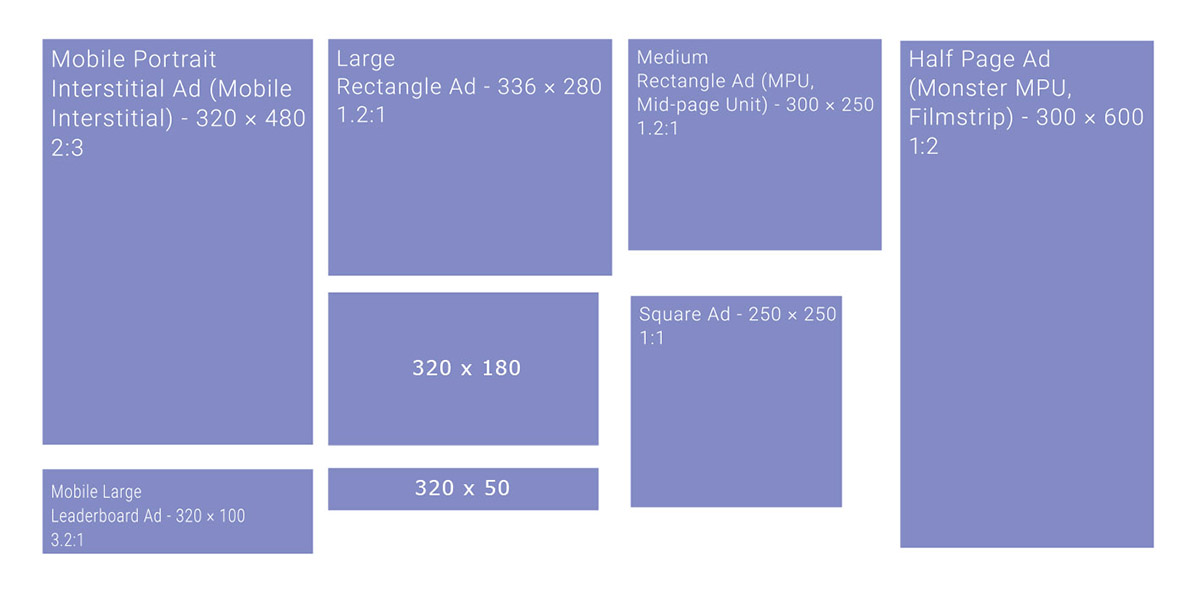
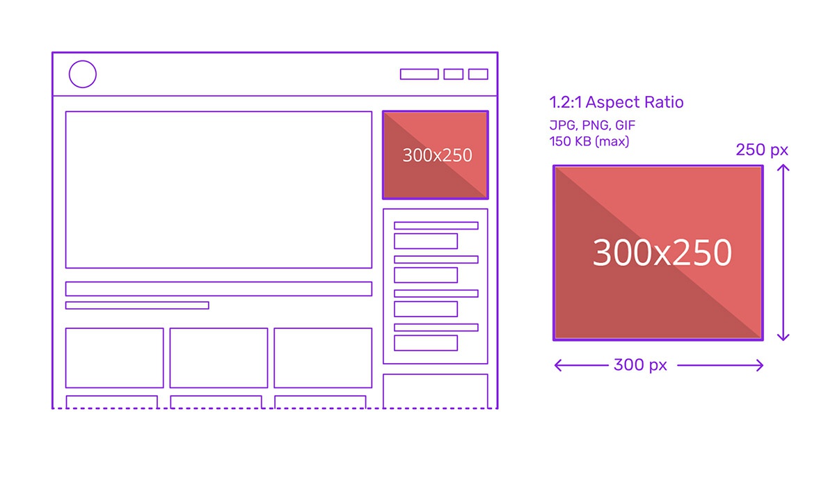
Furthermore, it’s flexible: it can be used as a standard or expandable unit and is often paired with other ad formats like 300×250 or 728×90 for broader campaign strategies.
Drawbacks Of The 160×600 Ad

Despite its strengths, the 160×600 ad comes with certain limitations. Demand has decreased in favor of more universally favored formats like 728×90 or 300×250, leading to lower CPMs and more frequent unfilled inventory. Its narrow shape also limits creative possibilities, making it harder to convey complex messages or brand storytelling.
Additionally, not all screen sizes or mobile experiences support skyscraper placements well, reducing its versatility in responsive design contexts.
Pros:
- Persistent visibility as users scroll, best to use along the sidebars of websites
- Strong for brand awareness and upper-funnel campaigns
- IAB standard, widely supported by ad networks
- High viewability and decent CTRs
- Can be integrated into homepage takeovers and side navigation areas
Cons:
- Lower CPM compared to more popular display banners
- Limited design space for messaging
- Less popular with buyers, leading to fill-rate issues
- Not a mobile-specific ad banner or ideal for responsive layouts
120×600 vs 160×600 Banner Ads
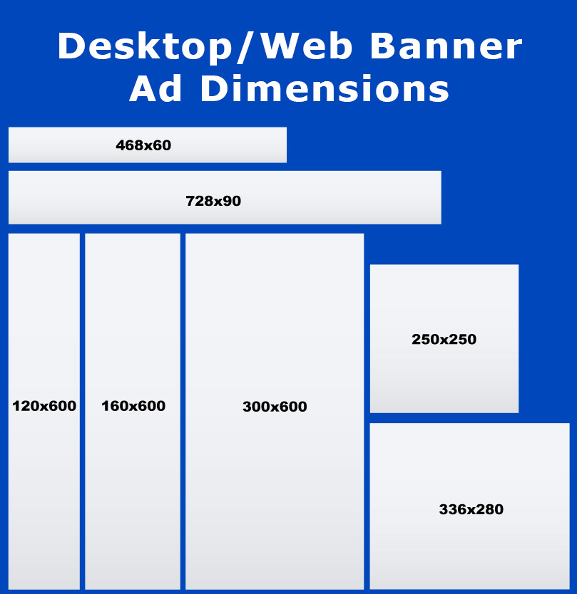
Marketers have increasingly phased out 120×600 banner ads because the marginal cost of using more narrow creative no longer justifies the loss in performance. The improved visibility and engagement of 160x600s provide a stronger ROI, especially in branding campaigns where screen presence matters.
Moreover, as digital standards evolve, sticking to legacy sizes like 120×600 can result in reduced inventory availability and compatibility issues. By switching to 160×600, marketers not only adapt to current IAB standards but also position their campaigns for higher performance and reach, making it the smarter choice in today’s web banner advertising landscape.
Here are some advantages of the 160×600 banner ads over the 120×600 ones:
- Larger ad space for messaging and visuals
- Better engagement and visibility
Modern platform compatibility - Greater design flexibility
- Stronger support from ad networks and publishers
Examples Of Using Skyscraper Ad Size
Below are some examples of brand use cases that highlight how the dimensions and format of the 160×600 influence layout, brand messaging, and performance:
Adobe – Make it with creative cloud

Adobe’s skyscraper ad makes strategic use of the tall 600-pixel height by showcasing a clean vertical progression: brand logo in red, the main message “Make it with creative cloud” right in the center, attention-grabbing feature image, and a “Join now” CTA button in blue. The logo and the CTA button create a strong contrast that catches viewers’ eyes.
Applebee’s – Get $10 off your next $30+ online order
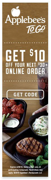
Applebee’s 160×600 ad uses the tallest portion to feature a $10 discount in way bigger text, smaller fine print underneath, the image of juicy beefsteak in the background, and a strong “Get code” CTA at the bottom. The tall layout allows for a strong visual hierarchy, making the main benefit the most visible at the top, with supporting details below, which is ideal for time-sensitive promotions.
Amazon Fresh – Just Bare Chicken; Certified Organic; Certified Goodness
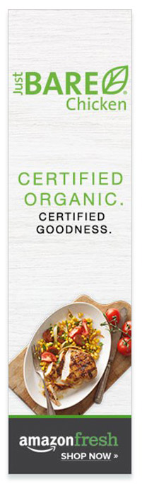
Amazon Fresh’s ad uses the 160×600 format to showcase vertically the brand’s selling points: Just bare chicken, certified organic, and certified goodness in green, standing out in the white background. The skyscraper size allows for more white space, creating a sense of cleanliness and hygiene.
See more common Ad banner sizes: