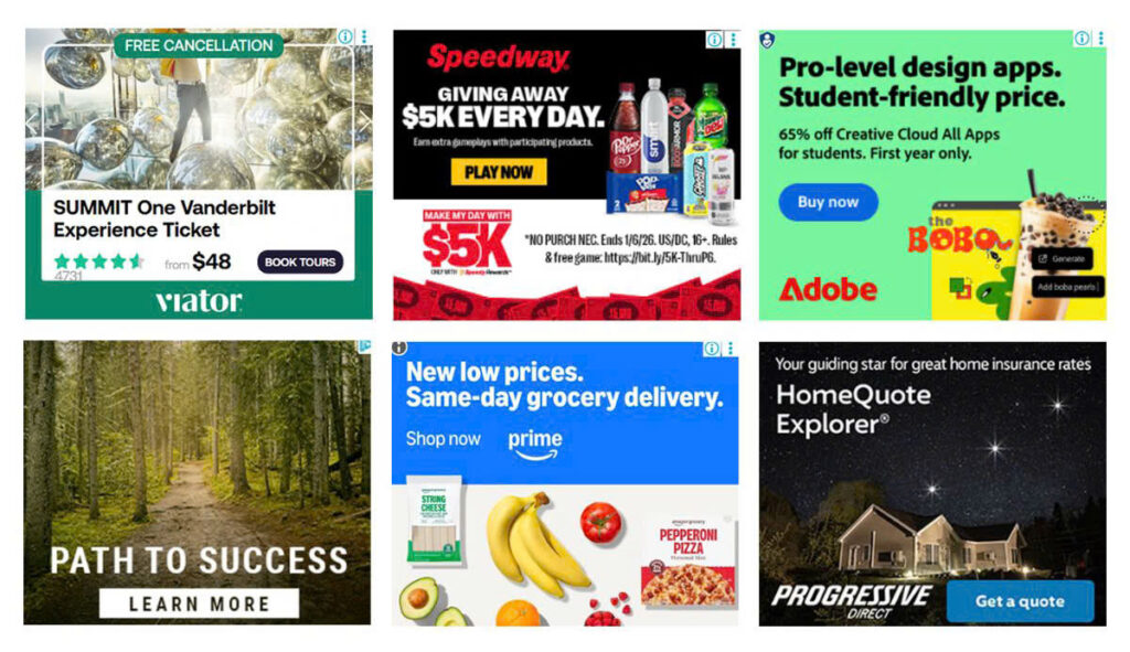
The 300×250 ad unit, better known as the Medium Rectangle or MPU, might not be flashy, but it gets results. It’s one of the most popular ad sizes in digital media for a reason: it works well on desktop and mobile, loads fast, and fits almost anywhere. If you’re just starting with banner ads or want to improve your current ad placements, this article has you covered!
In This Article:
About The 300×250 Banner – A MPU
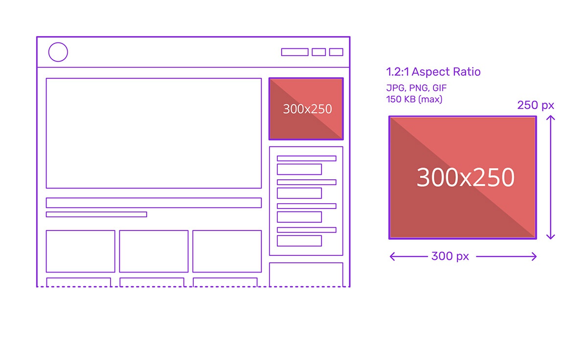
The 300×250 ad unit, widely known as the Medium Rectangle or MPU (Mid Page Unit), is one of the most prolific and effective formats in digital advertising. Measuring 300 pixels wide by 250 pixels tall, this IAB-standard unit occupies a modest 75,000 pixels of screen real estate yet consistently outperforms larger formats in both click-through rates (CTR) and cost-per-thousand impressions (CPM).
Additionally, the 300×250 is often used in multi-sized ad slots alongside other formats like the 300×600, allowing for flexible ad inventory management. Its utility extends beyond standard display banners; it’s also deployed as a video pre-roll container, a sticky anchor ad, or a launcher for overlays and interactive ad experiences.
Benefits Of 300×250 Ads
High Click-Through Rates (CTR)
The 300×250 ad unit consistently delivers some of the highest CTRs among standard display formats, thanks to its frequent placement above the fold and its ability to capture user attention without being intrusive. Its shape and size create a visual break in content, making it more likely to be seen and interacted with.
Strong Revenue Performance (High CPM)
As one of the top-performing units in terms of cost-per-thousand impressions (CPM), the Medium Rectangle is a favorite among advertisers, driving up competition and thereby increasing revenue for publishers. It often yields better returns than larger formats like the 728×90 leaderboard or 160×600 skyscraper, especially when strategically positioned.
Versatile Placement Options

The 300×250 MPU’s dimensions allow for flexible deployment in various webpage locations—such as sidebars, within content, headers, and footers. It integrates seamlessly across different layout designs and can be used standalone or in combination with other ad units in multi-size slots.
Cross-Device Compatibility
This ad unit is highly adaptable across screen types. It renders cleanly on both desktop and mobile devices, making it an ideal choice for responsive design. On mobile, it often appears within the content stream, while on desktop, it’s commonly seen in side columns or as inline breaks.
Multi-Format Capabilities
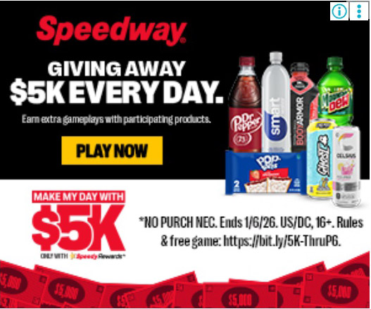
Despite its compact size, the 300×250 supports a range of ad types, including static images, animated GIFs, rich media, expandable creatives, and even video ads. This makes it a highly flexible canvas for different creative strategies, from branding to direct response.
Enhanced User Engagement
Because it’s often embedded in content or appears at key interaction points (like game pauses or article mid-points), the 300×250 MPU is naturally integrated into the user’s journey, leading to better engagement rates and user retention compared to interruptive formats.
Integration with Sponsorship and High-Impact Campaigns
Its strong performance and visibility make it a popular choice for sponsored placements, homepage takeovers, and roadblocks. It also serves as a launching point for interactive overlays and pre-roll video ads, making it valuable in high-budget campaign strategies.
Design-Friendly Dimensions
The aspect ratio of the 300×250 allows for concise messaging and strong visual hierarchy. While limited in space, it encourages clarity and focus in ad design, often leading to better user comprehension and stronger calls to action.
Best 300×250 Web Banner Placements
The effectiveness of the 300×250 Medium Rectangle ad unit depends heavily on its placement within a webpage or app environment. Below are the most effective placement zones you can try:
- Above the fold (top of page): Placing the ad where users immediately see it without scrolling ensures maximum visibility. Since many users don’t scroll far down a page, this spot often garners the highest CTRs and CPMs, making it the most valuable real estate.
- Top of the right-hand column (desktop): A classic placement for publishers, the right sidebar near the top is one of the first places the eye travels, especially on news and blog layouts. It balances visibility with non-intrusiveness, ideal for monetizing without disrupting the content flow.
- Within content (in-article): Embedding the 300×250 within long-form content creates natural interaction breaks, boosting engagement. These placements are especially effective on mobile, where vertical scrolling dominates, and ads can seamlessly blend into the reading experience.
- Top of left-hand column: While less common than right-hand placements, positioning the ad on the left can align with reading direction in left-to-right languages, increasing early visibility before the user even starts engaging with the interactive content.
- After paragraphs or content sections: Inserting the ad after meaningful content blocks helps maintain a balanced user experience while placing the ad at a point when the user is more likely to pause. These breaks serve as effective attention points without being disruptive.
- Pause screens or level completion (in apps & games): In gaming and mobile app environments, showing a 300×250 ad during a pause or between levels avoids interfering with gameplay while offering a highly focused interaction moment. It’s effective as long as the ad is clearly separated from navigational elements.
- Sticky anchor on desktop: When used as a sticky ad that remains visible as users scroll, the MPU can deliver consistent visibility without being too aggressive. Careful execution is essential here to avoid accidental clicks or policy violations.
- Interstitial or expandable formats: Though technically more advanced, placing 300x250s in expandable or interstitial ad experiences enables high-impact messaging while maintaining IAB compliance. These are often used in premium placements or sponsorship deals.
Tips For Using 300×250 pixels Ads
Below are expert-backed tips to help you deploy this ad format effectively:
- Avoid cluttering with multiple MPUs: Overusing the same ad unit on a single page can reduce its value and overwhelm users. Use only one or two MPUs per page, and clearly differentiate premium placements (e.g., above the fold) from secondary ones to segment pricing and performance.
- Maintain clear visual separation from content: Ads that mimic site content may lead to accidental clicks and violate ad network policies. Use borders, labels like “Sponsored,” and distinct visual design to clearly distinguish ads from editorial or app content.
- Optimize for mobile and desktop: Ensure that the ad scales properly on smaller screens and is not too close to navigational buttons or interactive elements.
- Use clean, focused design: The limited size of the MPU means cluttered visuals can confuse or repel users. Stick to bold CTAs, readable fonts, and minimal imagery. Let the message stand out with a clear value proposition and brand identity.
- Time your loads and limit frequency: Excessive ad repetition and premature loading can slow pages or lead to user fatigue. Set frequency caps and use lazy loading so ads only load when they’re nearly in view, preserving site speed and user experience.
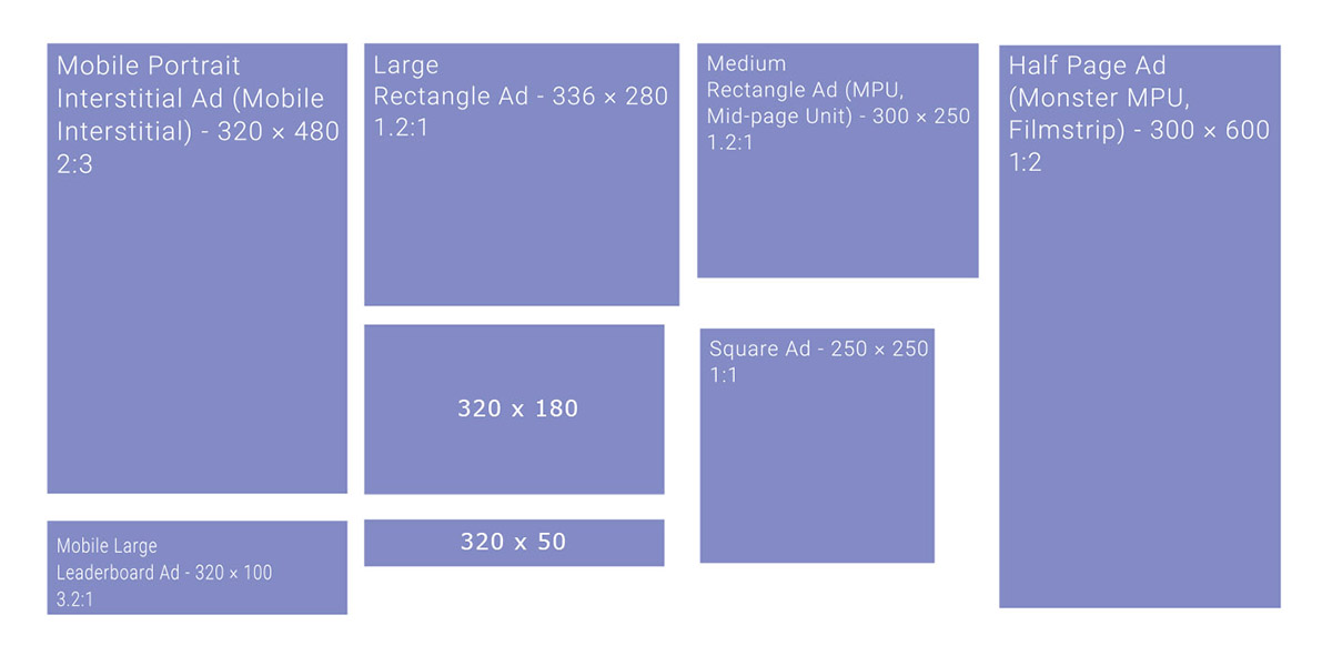
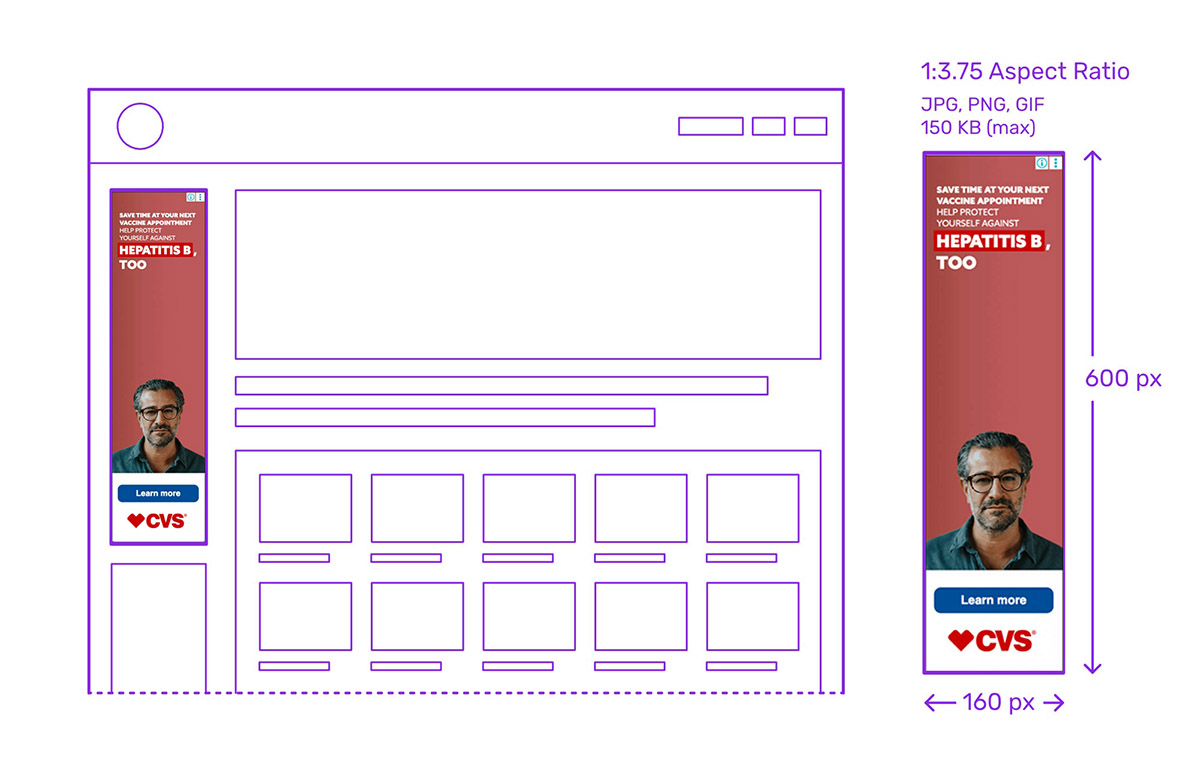
- Combine with complementary ad units: The 300×250 performs well in tandem with larger units in multi-size ad slots. Pair with formats like the 300×600 or 728×90 leaderboard to diversify revenue without creating layout conflict.
- Follow ad network compliance guidelines: Improper implementation can lead to policy violations and loss of ad serving rights. Avoid overlapping ads, placing them on blank pages, or positioning them near essential UI elements like “Next” or “Close” buttons.
Case Studies – How Brands Use 300×250 Ads
Apple Graphic Studio – Get your first ad banner 30% off
The ad immediately grabs attention with a colorful, styled image of a person on the right, balancing the text-heavy left side. “Get your first ads banner 30% OFF” is prominently featured in large, white text against a dark background, making it easy to read.
The studio name and tagline (“FREE DESIGN TUTORIALS”) are concise and placed at the top. A large red “CONTACT” button provides a crystal-clear next step. All these elements fit nicely within a 300×250 frame.
Diesel – Get inspired by the new arrivals
The Diesel logo in red commands immediate attention in the upper left, while a high-quality, fashion-forward image of a model evokes the brand’s lifestyle identity on the right. The line “Get inspired by the new arrivals” followed by “Discover now the brand-new collection” is more narrative than urgent, aligning with brand storytelling. This layout maintains a high-end feel by avoiding visual overcrowding in a 300×250 ad.
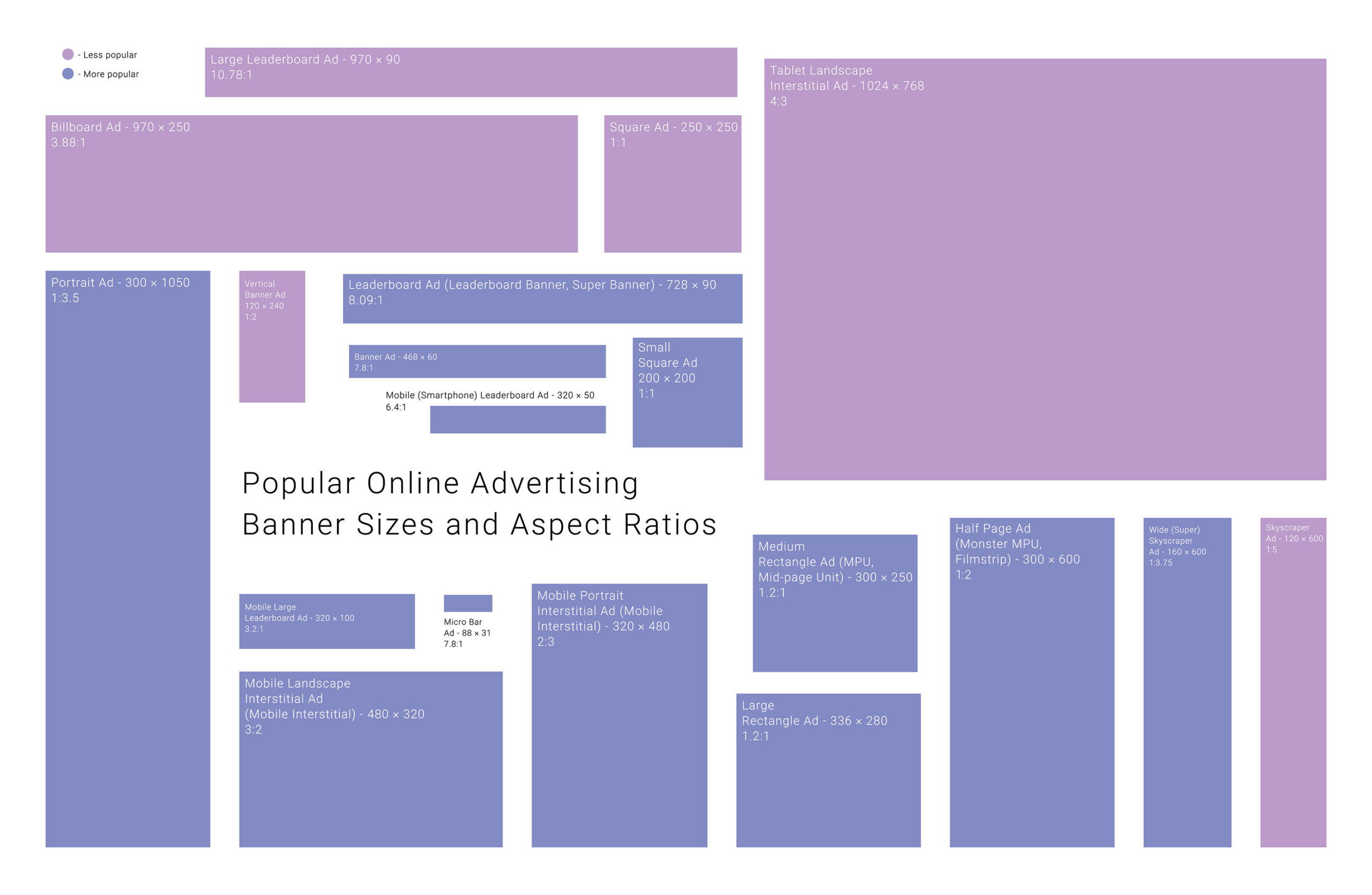
See more common Ad banner sizes: